Tel: 07866 747 849
How to Design a Garden When you See Colour Differently
Life as a Colour Blind Garden Designer in West Sussex. How to Design a Garden When you See Colour Differently.
When people imagine garden design, they often picture swathes of carefully coordinated colour, vibrant borders, harmonious palettes, and seasonal transitions that delight the eye. But what happens when the designer themselves doesn’t see colour in quite the same way?
As a garden designer based in West Sussex, working with colour blindness has been both a challenge and an unexpected advantage. It has shaped not only how I approach planting design, but also how I understand gardens as immersive, multi-sensory spaces rather than purely visual compositions.
The Challenge of the Red–Green Spectrum
Like many people with colour vision deficiency, I experience difficulty distinguishing between shades in the red, green, and brown spectrum. In a garden context, this can present some obvious complications. Fresh spring foliage, for example, can appear very similar to certain flowering plants. A deep burgundy leaf may read as a muddy brown, while subtle tonal differences between shrubs can easily be lost.
This becomes particularly tricky when clients request specific colour schemes, “warm reds and oranges” or “cool purples and blues”, as these distinctions are not always immediately apparent to me. Even something as seemingly straightforward as identifying plant health can require closer inspection, as early signs of stress or disease often manifest through slight colour changes.
Building Trust (and When to Share)
One aspect that is less often discussed is how and when to communicate this with clients. I don’t always tell clients when we first meet that I am colour blind, as I feel it’s not always the most positive introduction to a working relationship between client and garden designer. First impressions matter, and I want clients to feel confident in my ability to deliver a beautiful, well-considered garden.
That said, transparency is important. As a project develops, I am always open about how I work and the processes I use to ensure planting schemes meet expectations. In reality, most clients are far more interested in the end result than the method—and many are reassured to learn that the design has been approached with even greater care and attention to detail.
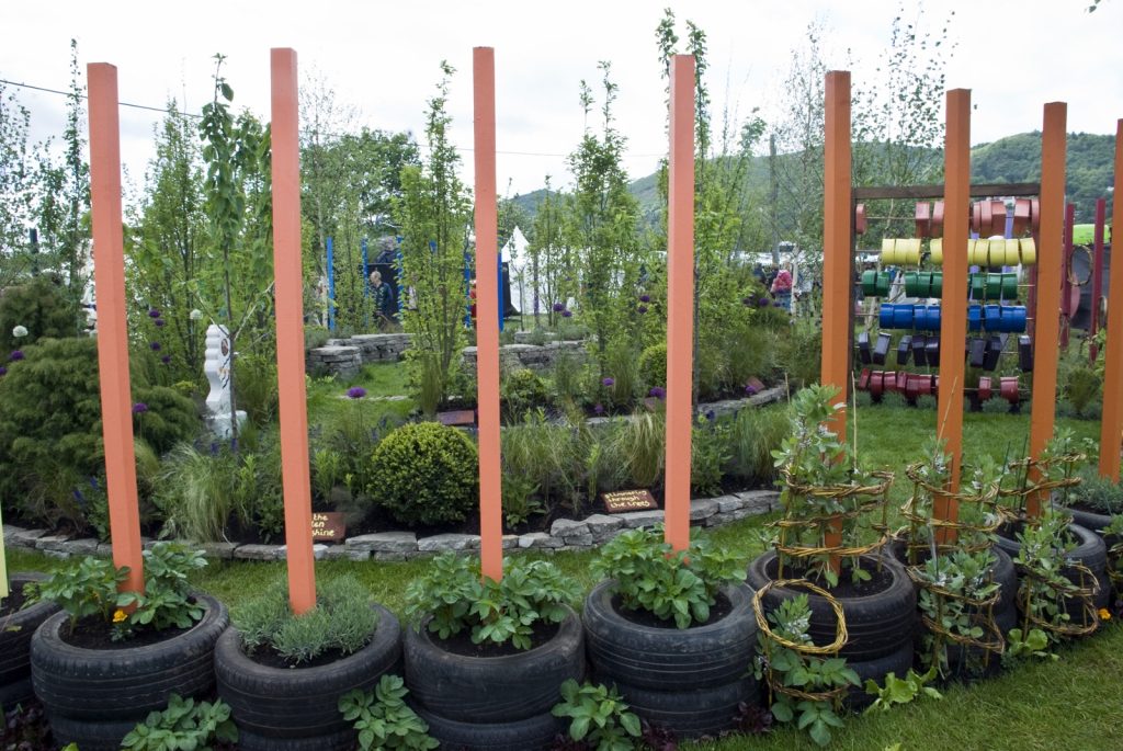
Beyond Colour: Designing with Structure and Contrast
Rather than seeing this as a limitation, it has encouraged me to design in a more holistic and arguably more enduring way. Instead of relying primarily on colour, I focus on structure, texture, form, and contrast.
Leaf shape becomes as important as flower colour. The interplay between fine, feathery foliage and bold, architectural leaves creates visual interest that is independent of hue. Similarly, contrast can be achieved through light and dark tones, rather than specific colours—something that is often more legible regardless of colour perception.
Seasonality also takes on a different meaning. Instead of chasing a sequence of colour changes, I consider how a garden evolves in form throughout the year: the skeletal beauty of winter stems, the emergence of spring growth, and the fullness of summer planting.
Building Confidence in a Colour Focused Industry
One of the biggest hurdles has not been practical, but psychological. Garden design, as an industry, places a strong emphasis on colour theory. Early on, it was easy to feel that I was missing a fundamental skill.
Over time, however, I’ve learned to trust my process. I use tools, references, and collaboration where needed—plant labels, photography, and occasionally a second opinion—but I no longer feel defined by what I can’t see. Instead, I lean into what I can perceive strongly: balance, rhythm, and spatial composition.
Interestingly, many clients respond positively to this approach. Gardens designed with a focus on structure and texture often feel calmer, more cohesive, and easier to maintain visually throughout the seasons.
A Different Way of Seeing
Colour blindness has forced me to ask deeper questions about what makes a garden truly successful. Is it the brightness of a border in July, or the way a space feels to inhabit year-round? Is it about visual impact alone, or about movement, scent, sound, and touch?
By stepping away from a purely colour-driven mindset, I’ve found greater freedom in design. Grasses moving in the wind, the tactile quality of planting, the sound of leaves rustling, and the framing of views—all become central elements rather than afterthoughts.
In many ways, not relying on colour has expanded my creative toolkit. It has made me more attentive, more experimental, and more open to combinations that might otherwise be overlooked.
Embracing Difference in Design
What might initially seem like a disadvantage has become a defining feature of my work. It challenges assumptions—both my own and those of my clients—and encourages a more layered, thoughtful approach to garden design.
Gardens are, after all, living spaces. They are experienced, not just seen. And perhaps designing without a full reliance on colour allows for something richer: spaces that resonate on multiple levels, and that remain engaging no matter how they are perceived.
Being a colour blind garden designer isn’t about overcoming a limitation. It’s about designing differently and discovering that “different” can be a strength.